bar chart in matplotlib tutorial with example
The bar chart in matplotlib will display data with parallel rectangular bars of equal width along axis. It is used to make comparison between different groups. Barplot or bar chart is the common type of plot. It shows relationship between the numerical and categorical variable. You can display height of several individuals using bar chart. They are confounded with histograms which are different. The mistake is to use the barplots to represent average value of each group. The bar graph present data with rectangular bar with height or length which is proportional to value that they represent. They can be plotted vertically or horizontally. Bar graphs are good if you want to present data of different group compared with each other.
Firstly to create any bar chart/graph as single or multiple we need to import libraries to implement our task.
- Panda’s library will help us to import countries like ‘csv’ files.
- In the numpy library we will use np.arrange() which will work to range(10)=[0,1,2,3,4,5,6,7,8,9]
- And now the important library helps us to visualize data is matplotlib,used to plot multiple graphs in python
Matplotlib bar graph Example:-
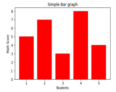
Suppose you want to show the comparison between cities in term of annual income.
#name of graph
Plt.title(“simple bar graph”)
#Assign name of x axis
plt.xlabel(“students”)
##Assign name of y axis
Plt.ylabel(“math score”)
#change bar color
plt.show()
You can make style in your graph using the following functions –
Plt.title():-used for specifying title of your plot.
Plt.xlabel():-used for labeling x axis.
Plt.ylabel():-used for labeling y axis.
Color:-option in plt.bar () for defining color of bars.
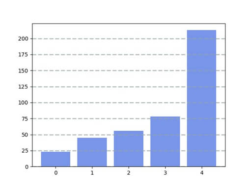
Grid lines:-
To get the gridline you add the function call grid () with the color, line style, width and axis. You can also add alpha value.
Grid lines Example:-
Import numpy as np
Import pandas as pd
From pandas import series, Dataframe
Import matplotlib.plot as plt
Data= [23, 45, 56, 78,213]
Plt.bar (range (len(data)),data, color=’royalblue’,alpha=0.7)
Plt.grid(color=’#95a5a6’,linestyle=’--’,linewidth=2,axis=’y’,alpha=0.7)
Plt.show()
Stack charts
You can stack bar charts on top of each other graphs. That is useful when you multiple values combine into greater.
Example:-
Import numpy as np
Import pandas as pd
From pandas import series, Dataframe
Import matplotlib.pyplot as plt
Data1= [23, 85, 72, 43, 52]
Data2= [42, 35, 21, 16, 9]
Plt.bar (range (len(data1)),data1)
Plt.bar(range(len(data2)),data2,bottom=data1)
Plt.show()
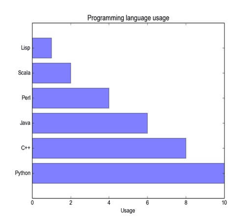
Horizontal bar chart:-
The below example shows the horizontal bar chart,Example:-
Import matplotlib.pyplot as plt;
Import numpy as np
Import matplotlib.pyplot as plt;
Objects=(‘python’,’c++’,’java’,’perl’,’scala’,’lisp’)
Y_pos=np.arrange (len(objects))
Performance= [10, 8, 6, 4, 2, 1]
Plt.barh(y_pos,performance,align=’center’, alpha=0.5)
Plt.yticks(y_pos,objects)
Plt.xlabel(‘usage’)
Plt.title(‘programming language usage’)
Plt.show()
Output:-
Plotting bar charts:-
The stacked bars are course possible by using special parameters from pyplot.bar () function.Example:-
import matpltlib.pyplot as plt
A= [5, 30. 45., 22.]
B= [5, 25, 50, 20.]
X=range (4)
Plt.bar (x,A,color=’b’)
Plt.bar(x,B,color=’r’,bottom=A)
Plt.show()
The program will produce the following graph,
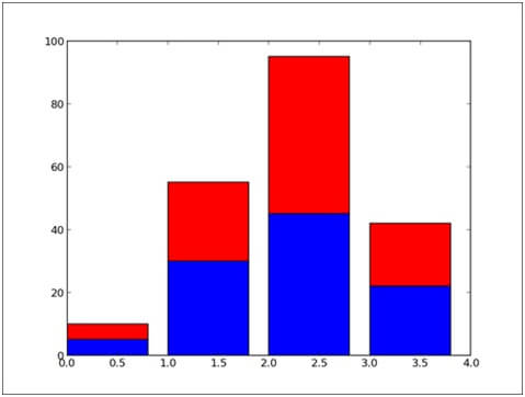
The bottom parameter of the pyplot.bar () function will you to specify a starting value for a bar.
Instead of running from zero to a value, it will go from the bottom to value.
The firstly pyplot.bar () will plots the blue bars.
Then pyplot.bar () will plots the red bars, with the bottom of the red bars is at the top of the blue bars.