Countplot in Python Tutorial
Seaborn countplot in Python : In this point we have to create a counter plot in seaborn with python.
Seaborn is a module in python that is built on top of matplotlib that is designed for plotting.
Seaborn can plot all types of graphs. One graph to create is the counterplot using seaborn with the python.
The seaborn is module in python that is build on top of matplotlib that is designed for statistical plotting.
In counter plot the histogram or bar for some graph area is seen.
It is very simple to show number of occurrence of item and is based on certain type of category.
Bar graph is used for displaying relationship between data at least one numerical variable.
Seaborn.countplot is the barplot and the dependent variable is number of instance of each independent variable.
The countplot can be through a histogram across a categorical instead of variable.
The API and option are identical to barplot() so you compare counts across nested variable.
The vectors of data are the list, arrays, or pandas and directly passed to x, y and hue parameters.
A wide dataframe in which numeric column will be plotted and array,list.
The function will always treat as categorical at position (0, 1…n).
.
Parameters:- |
x, y, hue : names of variables in data or vector data, optional |
Return: |
ax : |
Show point estimates and confidence intervals using bars.
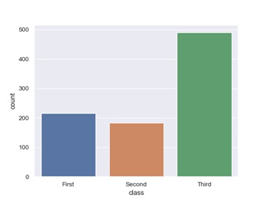
Example:-
Show value that counts for a single categorical variable,
Import seaborn as sns
Sns.set (style=”darkgrid”)
titanic=sns.load_dataset(“titanic”)
ax=sns.countplot(x=”class”, data=titanic)
Output:-
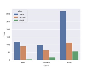
It will show the value counts for two categorical variables,
Example:-
ax=sns.countplot(x=”class”, hue=”who”, data=titanic)
Output:-