Matplotlib line plot in Python Tutorial with example
The basic Matplotlib line plot in Python is shown for different subsets of data using hue, size and style parameters. These parameters are used to identify different subsets and are possible to show up to three dimensions independently. It is possible to show up three dimensional independently using all three semantic types. The style of plot can be hard to interpret.
By default the plot aggregates over multiple y values at each of the x values.
Parameters:- |
x, y : hue_norm:Normalization in data units for colormap applied to the hue variable when it is numeric.Not relevant if it is categorical. sizes : An object that determines how sizes are chosen when size is used. It can always be a list of size values or a dict mapping levels of the size variable to sizes. When size is numeric it can also be a tuple specifying the minimum and maximum size to use such that other values are normalized within this range. size_order : Specified order for appearance of the size variable levels they are determined from the data. Not relevant when the size variable is numeric. size_norm : Normalization in data units for scaling plot objects when the size variable is numeric. dashes : Object determining how to draw the lines for different levels of the style variable. Setting to True will use default dash codes, or you can pass a list of dash codes or a dictionary mapping levels of the style variable to dash codes. Setting to False will use solid lines for all subsets. Dashes are specified as in matplotlib a tuple of lengths or an empty string to draw a solid line. markers : Object determining how to draw the markers for different levels of the style variable. Setting to True will use default markers or you can pass a list of markers or a dictionary mapping levels of the style variable to markers. Setting to False will draw markerless lines. Markers are specified as in matplotlib. style_order : Specified order for appearance of the style variable levels otherwise they are determined from the data. Not relevant when the style variable is numeric. units : Grouping variable identifying sampling units. When used a separate line will be drawn for each unit with appropriate semantics, but no legend entry will be added. Useful for showing distribution of experimental replicates when exact identities are not needed. estimatorMethod for aggregating across multiple observations of the y variable at the same x level.If None, all observations will be drawn. ci : Size of the confidence interval to draw when aggregating with an estimator. “sd” means to draw the standard deviation of the data. Setting to None will skip bootstrapping. n_boot : Number of bootstraps to use for computing the confidence interval. sort : If True the data will be sorted by the x and y variables otherwise lines will connect points in the order they appear in the dataset. err_style : Whether to draw the confidence intervals with translucent error bands or discrete error bars. err_band : Additional paramters to control the aesthetics of the error bars. The kwargs are passed either to ax.fill_between or ax.errorbar, depending on the err_style. legend : How to draw the legend. If “brief” numeric hue and size variables will be represented with a sample of evenly spaced values. If “full” every group will get an entry in the legend. If False no legend data is added and no legend is drawn. ax : Axes object to draw the plot onto otherwise uses the current Axes. kwargs : key, value mappings Other keyword arguments are passed down to plt.plot at draw time. |
Returns: |
ax : matplotlib Axes |
The axes are what we see above a bounding box with ticks and labels which will contain the plot elements that make up our visualization.
We have created axes and use the function to plot some data.
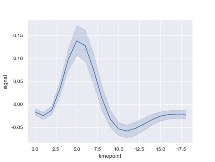
Let's start with a simple sinusoid:
Example:-
Import seaborn as sns; sns.set ()
Import matplotlib.pyplot as plt
Fmir=sns.load_dataset (“fmri”)
ax=sns.lineplot(x=”timeplot”,y=”signal”,data=fmri)
Output:-
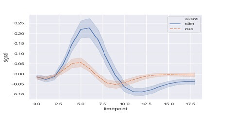
Now Group by another variable and show the groups with different colors,
Example:-
ax=sns.lineplot(x=”timepoint”,y=”signal”, hue=”event”, data=fmri)
Output:-

Now show the grouping of variable with both color and line dashing.
Matplotlib line plot in Python Example:-
x=sns.lineplot (x=”timepoint”, y=”signal”, hue=”event”, data) =fmri