seaborn barplot in Python Tutorial with example
Seaborn barplot in Python Tutorial : The bar plot is one of most comman type of plot and show relation between numerical and categorical variable. Mistake while using bar plot is to represent the average value of each group. Doing the boxplot or violineplot you should show number of observation per group. While creating barplot the survivors of titanic crash is based on category. The seaborn will support many barplots and combine seaborn with the matplotlib to several plot.
The data sets are included with the seaborn but this is only a demo.
The palette parameter will define the color that are used currently ‘hls’ by any palette.
A bar plot will represent an estimate of central tendency for a numeric variable with the height of each rectangle and will provide some indication of the uncertainty around estimate using error bars.
The Bar plot will include 0 the quantitative axis range, and are of good choice when 0 is a meaningful value for the quantitative variable and you want to make comparisons against it.
The datasets where 0 is not a meaningful value a point plot will allow to focus on differences between levels of one or more categorical variables.
The bar plot show only the mean value but in many cases it may be more informative to show the distribution of values at each level of the categorical variables.
The Vectors of data are represented as numpy arrays or panda’s objects passed directly to the x, y, and hue parameters.
It is possible to use Python objects but panda’s objects are used because the associated names will be used to annotate the axes. Categorical types for the grouping variables are used to control the order of plot elements.
Parameters:- |
x, y, hue : names of variables in data or vector data, optional |
Returns: |
ax : |
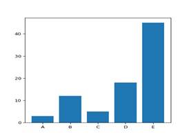
Seaborn barplot Example 1:-
Import numpyb as npImport matplotlib pyplot as plt
#make a fake dataset:
Height=[3,12,5,18,45]
Bars=(‘A’,’B’,’C’,’D’,’E’)
y_pos=np.arange(len(bars))
#create bars
Plt.bar(y_pos,bars)
#show graphic
Plt.show()
Output:-
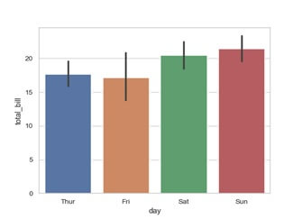
Example2:-
Now draw set of vertical bar plot grouped by a variable,
Import seaborn as sns
Sns.set(style=”whitegrid”)
tips=sns.load_dataset(“tips”)
ax=sns.barplot(x=”day”,y=”total_bill”,data=tips)
Output:-
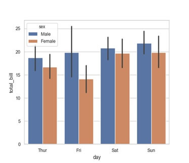
Below is the set of vertical bard with nested grouping by the two variables.
Example 3:-
ax=sns.barplot(x=”day”,y=”total_bill”,hue=”sex”,data=tips)
Output:-
Example 4:-
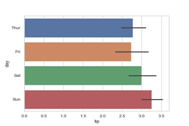
Draw the graph using the horizontal bars.
ax=sns.barplot(x=”tip”,y=”day”,data=tips)
Output:-
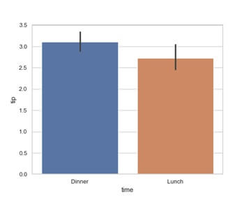
Example 5:-
The control bar order by passing in an explicit order.
ax=sns.barplot(x=”time”,y=”tip”,data=tips,orde=[“Dinner”,”Lunch”])
Output:-