seaborn python | seaborn in python
Seaborn python library is used for making the graphics in a python programming language.
It is located at the top of the matplotlib and integrated with the panda data structure.
Aim of seaborn python is to make the central part of understanding the data.
Seaborn has data visualization based on the matplotlib and provides high level interface and informative graphics.
Using the seaborn python library we can draw the charts such as matrix plot, regression plot, grid plots, etc.
It is used for the statistical info graphics in python programming and support numpy. Also supports the scipy units.
The visualization is used to explore and understand the data and seaborn makes it easy.
Seaborn will make it easy and in the well-defined manner.
Functionality of seaborn python is as follows:-
- The support for variables to show aggregate statistics and observation.
- The automatic estimation and plotting of regression for different variables.
- We have a view on the structure of data sets.
- There are tools for choosing the color palettes in your data.
Downloading steps:-
The seaborn library can be downloaded in many ways using pip installer and execute command to download library.
pip install seaborn
If you are using the anaconda distribution of python you execute the command to download the library,
Conda install seaborn
Use of seaborn in python:-
It is used to plot the time of series data and representation.
- Functions are also used for visualization and distribution for comparing a subset of data.
- The plotting of grids of high-level abstracting and build complex visualization.
- The build-in themes are used for graphics
- The tools are used for the color palettes and make a pattern in your data.
Steps for install Seaborn in Python :-
Step1:-First step is to install seaborn in PythonCheck the things below are installed on your machine:-
- Pandas
- Matplotlib
- Python 2.7+python3
- Seaborn
- Jupyter notebook
Also use the anaconda distribution for downloading.
Step2:-Import libraries and the data sets.
Pandas are the libraries used for managing the datasets.
import pandas as pd
After this we import matplotlib in the jupyter notebook.
From matplotlib import pyplot as plt
%matplotlib inline
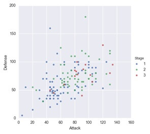
Step 3 Seaborn is plotting function:-
It has the diversity of plotting the graph and make the scatter plot using the lmplot () function.
Two ways as follows:-
- To pass the Data Frame to data=argument by passing the column name to axes x= and y=.
- Directly pass in the series to axes the arguments.
Scatter plot Exaple :-
Example:-
Sns.implot (x=’Attack’, y=’Defense’, data=df)
The seaborn do not have to scatter plot function but we use the function for fitting and plotting the regression line.
Step 4 Customizing with the matplotlib:-
The seaborn is high level language interface that matplotlib.
Firstly invoke the seaborn plotting as the normal function.
Then the matplotlib function as we use the ylim () and xlim () function.
Example:-
sns.lmplot (x=’Attack’, y=’defense’, data=df,
fit_reg=False,
hue=’stage’)
plt.ylmin (0, None)
plt.xlmin (0, None)
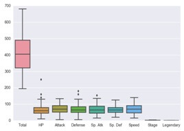
Step5 Role of pandas:-
In the seaborn pandas play an important role using the Data Frame.
Example:-
Sns.boxplot (data=df)
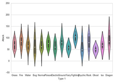
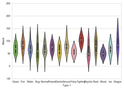
Step 6 the advantage of seaborn is the themes used at right out of box.
This theme is called the dark grid then after making violin plot we can make darkgrid to whitegrid.
Example:-
Sns.ser_style (“whitegrid”)
Sns.violinplot (x=’Type1’, y=’Attack’, data=df)
Step7:-Color palettes
The seaborn will allow setting of the color palettes and create the ordered python list with hex values.
Example:-
Sns.violinplot (x=’Type1’, y=’Attack’, data=df,
Palette=pkmn_type_colors)
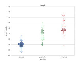
Step 8 Swarmplot:-
The swarmplot is same as the strip lot but the difference is that us will allow overlapping of markers and causes the jittering in markers.
We use this plot function to plot swarn plot .The next difference is that it is working with the data frames.
Example:-
import matplotlib.pyplot as plt
import seaborn as sns
sns.set (style=”whitegrid”)
iris=sns.load_dataset (‘iris’);
ax=sns.swarmplot (x=’species’, y=’sepal_length’, data=iris);
plt.title (‘graph’)
plt.show ()
Output:-
Step9:-Put all together:-
We combine information into the chart and have some data wrangling with pandas. stats_df.head ()
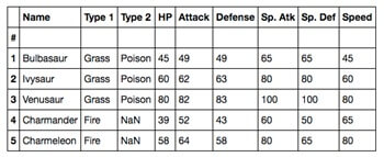
Step10:- Pokedex minigallery:-
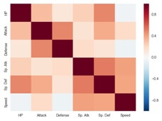
Heatmap is used to visualize matrix like the data.
Example:-
corr=stats_df.corr ()
sns.heatmap (corr)
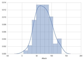
Histogram:-
Used to plot the distribution of the numeric variables.
Example:-
sns.distplot (df.Attack)
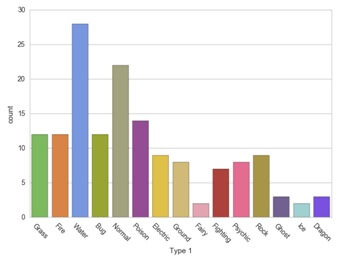
Bar plot:-
Used to visualize the distribution of the variables.
Example:-
sns.counterplot (x=’Type1’, data=df, palette=pkmn_type_colors)
plt.xtricks (rotation=-45)