Seaborn pairplot in Python tutorial
Seaborn pairplot in Python is made when you want to visualize the relationship between two variables and variables. Pairplot is usually a grid of plots for each variable in data set and sepal width, height. It is the data set.4 measurements it create 4*4 plots.
Creating a Pairs Plot in Python:-
The function in R is the pair plot which makes high level scatter plot to capture relationship between multiple variables within dataframe.
To my knowledge python does not have any built-in functions which accomplish this so I turned to Seaborn, the statistical visualization library built on matplotlib, to accomplish this.
Example:-
Import seaborn
sb.set(font_size=1.35,style=”ticks”)#set styling preferences
%matplotlib inline
Load the example iris dataset:-
Iris=sb.load_dataset(“iris”)Iris.head()
Output:-
sepal_length |
sepal_width |
petal_length |
petal_width |
species |
|
0 |
5.1 |
3.5 |
1.4 |
0.2 |
setosa |
1 |
4.9 |
3.0 |
1.4 |
0.2 |
setosa |
2 |
4.7 |
3.2 |
1.3 |
0.2 |
setosa |
3 |
4.6 |
3.1 |
1.5 |
0.2 |
setosa |
4 |
5.0 |
3.6 |
1.4 |
0.2 |
setosa |
Iris.describe()
sepal_length |
sepal_width |
petal_length |
petal_width |
|
count |
150.000000 |
150.000000 |
150.000000 |
150.000000 |
mean |
5.843333 |
3.057333 |
3.758000 |
1.199333 |
std |
0.828066 |
0.435866 |
1.765298 |
0.762238 |
min |
4.300000 |
2.000000 |
1.000000 |
0.100000 |
25% |
5.100000 |
2.800000 |
1.600000 |
0.300000 |
50% |
5.800000 |
3.000000 |
4.350000 |
1.300000 |
75% |
6.400000 |
3.300000 |
5.100000 |
1.800000 |
max |
7.900000 |
4.400000 |
6.900000 |
2.500000 |
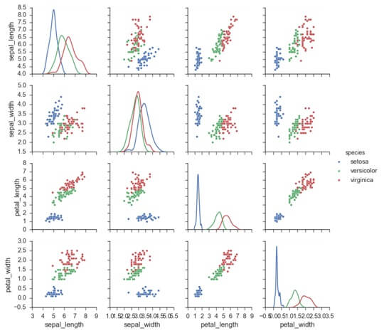
plot = sb.pa will show how different levels of a categorical variable by the color of plot elements
g=sns.pairplot(iris,hue=”species”)
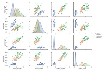
Use a different color palette:-
Irplot(iris,hue=’specie’)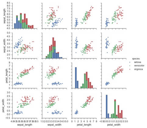
Plot pair wise relationships in a dataset.
The function will create a grid such as variable in data will share in y axis across and x axis across single column.
It is possible to show a plot to show distribution of data in column.
It is also possible to show a subset of variable or plot different variables on the rows and columns.
This is a high level interface for pair grid that is intended to make it easy to draw common style.
Parameters: |
data : DataFrame kindKind of plot for the non-identity relationships.diag_kind : {‘auto’, ‘hist’, ‘kde’}, optional Kind of plot for the diagonal subplots. The default depends on whether "hue" is used or not. markers : single matplotlib marker code or list, optional Either the marker to use for all datapoints or a list of markers with a length the same as the number of levels in the hue variable so that differently colored points will also have different scatterplot markers. Height : scalar, optional Height of each facet. aspect : scalar, optional Aspect * height gives the width of each facet. dropna : boolean, optional Drop missing values from the data before plotting. {plot, diag, grid}_kws : dicts, optional Dictionaries of keyword arguments. |
Returns: |
grid : PairGrid |
Subplot grid for more flexible plotting of pair wise relationship.
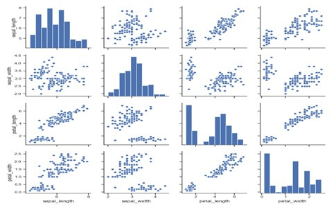
Examples:-Draw scatter plots for joint relationships and histograms for univariate distributions.
import seaborn as sns;sns.set(style=”ticks”,color_codes=True)
iris=sns.load_dataset(“iris”)
g=sns.pairplot (iris)
Output:-
Lot (iris, hue=’species’, diag_king=’kde’)