Matplotlib plot points in python Tutorial
A matplotlib plot points in python represents an estimate of central tendency for a numeric variable by the position of scatter plot points and provides some indication of the uncertainty around that estimate using error bars.
Point plots can be more useful than bar plots for focusing comparisons between different levels of one or more categorical variables. They are particularly adept at showing interactions: how the relationship between levels of one categorical variable changes across levels of a second categorical variable. The lines that join each point from the same hue level allow interactions to be judged by differences in slope, which is easier for the eyes than comparing the heights of several groups of points or bars.
It is important to keep in mind that a point plot shows only the mean (or other estimator) value, but in many cases it may be more informative to show the distribution of values at each level of the categorical variables. In that case, other approaches such as a box or violin plot may be more appropriate.
Input data can be passed in a variety of formats, including:
Vectors of data represented as lists, numpy arrays, or pandas Series objects passed directly to the x, y, and or hue parameters.
In most cases, it is possible to use numpy or Python objects, but pandas objects are preferable because the associated names will be used to annotate the axes. Additionally, you can use Categorical types for the grouping variables to control the order of plot elements.
Parameters:-
x, y, hue : names of variables in data or vector data, optional
Inputs for plotting long-form data. See examples for interpretation.
data : DataFrame array, or list of arrays, optional
Dataset for plotting if x and y are absent, this is interpreted as wide-form. Otherwise it is expected to be long-form.
Order, hue_order: lists of strings, optional
Order to plot the categorical levels in, otherwise the levels are inferred from the data objects.
estimator: callable that maps vector -> scalar, optional
Statistical function to estimate within each categorical bin.
ci : float or None, optional
Size of confidence intervals to draw around estimated values.
If none of bootstrapping will be performed and error bars will not be drawn.
n_boot: int, optional
Number of bootstrap iterations to use when computing confidence intervals.
units: name of variable in data or vector data, optional
Identifier of sampling units, which will be used to perform a multilevel bootstrap and account for repeated measures design.
markers: string or list of strings, optional
Markers to use for each of the hue levels.
linestyles : string or list of strings, optional
Line styles to use for each of the hue levels.
dodge: bool or float, optional
Amount to separate the points for each level of the hue variable along the categorical axis.
join : bool, optional
If True, lines will be drawn between point estimates at the same hue level.
scale : float, optional
Scale factor for the plot elements.
orient : "v" | "h", optional
Orientation of the plot this is usually inferred from the dtype of the input variables but can be used to specify when the "categorical" variable is a numeric or when plotting wide-form data.
color: matplotlib color, optional
Color for all of the elements or seed for light_palette when using hue nesting.
palette: seaborn color palette or dict, optional
Colors to use for the different levels of the hue variable. Should be something that can be interpreted by color_palette or a dictionary mapping hue levels to matplotlib colors.
ax: matplotlib Axes, optional
Axes object to draw the plot onto, otherwise uses the current Axes.
Plot a point plot:-
Let us draw a set of vertical points plot grouped by variable.
Example 1:-
Impory seaborn as sns
Sns.set (style=”darkgrid”)
Tips=sns.load_dataset (“tips”)
Ax=sns.pointplot (x=”time”, y=”total_bill”, data=tips)
Output:-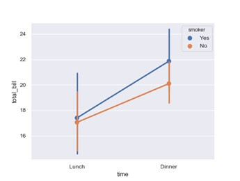
Example 2:-
Draw a set of vertical points with the nested grouping by two variables.
ax=sns.pointplot(x=”time”,y=”total_bill”,hue=”smoker”, data=tips)
Output:-
Separate the points for different hue levels in axis.
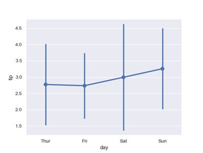
Example 3:-
ax=sns.pointplot(x=”day”,y=”tip”, data=tips,ci=”sd”)