Seaborn boxplot in Python
The boxplot shows three quartile values of distribution with end values. Each value in the boxplot corresponds to actual observation in data.The boxplot is introduced by john in classic book data analysis. Boxplot capture summary of data efficiency with simple box and whiskers and allows. Boxplots percentiles are also known as lower, median and upper. The advantage of comparing quartiles is that they are not influenced by outliers.
The boxplot is drawn as below:-
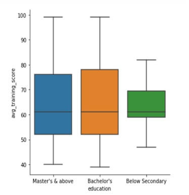
Sns.catplot (x=”education”, y=”avg_training_score”, kind=”box”, data=df2)If you are interested in learning more about the history and evolution of boxplots, check out Hadley Wickham’s 2011 paper 40 years of Boxplots.
In this post, we will see how to make boxplots using Python’s Pandas and Seaborn. Let us load the necessary packages needed to plot boxplots in Python.
Simple boxplot:-
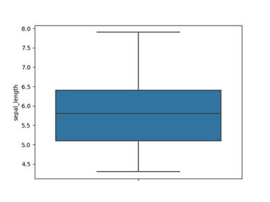
The boxplot is related with boxplot() method and example below will load iris flower dataset.
The presented boxplot will minimum, maximum, 1st quartile and 3rd quartile.
Example:-
Import seaborn as sns
Import matplotlib.pyplot as plt
Df=sns.load_dataset(‘iris’)
df.head()
sns.boxplot(y=df[“sepal_length”]);
plt.show()
Output:-
Seaborn boxplot Example:-
#import pandas
Import pandas as pd
#import matplotlib
Import matplotlib.pyplot as plt
#import seaborn
Import seaborn as sns
%matplotlib in line
Output:-
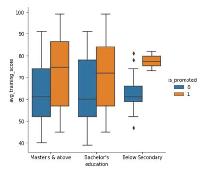
When we use hue semantic with boxplot, it is leveled with axis and don’t overlap.
The boxplot with hue is like-
Sns.catplot (x=”education”, y=”avg_training_score”, hue=”is promoted”, kind=”box”, data=df2)