Histogram matplotlib
Histogram is plot of frequency distribution array by splitting it to small equal sized bins. The splitting of small equally sized bins is done by histogram () method. Matplotlib can be used to create the histogram and It will show frequency on the vertical axis and horizontal axis.
Histogram is representation of numerical data where the data is binned and count for each bin is represented.
Histogram is aggregated bar chart with the aggregation functions like sum, avg, count.
A histogram is great tool for assessing probability distribution and is understood by audience.
Python will offer handful of options for building and plotting histograms.
Most people know histogram by graphical representation same as bar graph.
Matplotlib is used to create the histograms and show frequency on vertical and horizontal axis.Histogram is the representation of distribution of numerical data where data are binned and counted.
The histogram is an aggregated bar chart with several functions as sum, avg, count.
It will take one numerical variable value and the variable is cut into several bins. The shape of histogram can be different from number of bins that are set.
Histogram shows frequency on vertical as well as horizontal axis of another dimension.
They have bins and every bin has minimum/maximum value.
In this each bin also has a frequency between x and infinite.
Histogram has an accurate graphical representation and probability distribution of continuous variable and was developed by karl pearson.
The histogram is bar graph and the steps are to “bin “range of values that divide entire range of values.
The bins are specified as consecutive and non overlapping intervals of variables.
The bins must be adjacent and are of equal size.
Histograms are used for visualizing and distribution of the images.
The images are the combination of picture elements (pixels) ranging from 00 to 255255.
The x-axis denotes the number of bins while y axis denotes frequency of bin.
The number of bins means the parameter which is varied and based on how you want to visualize the data.
Steps to plot histogram in python:-
- Collect data for the histogram.
- Determine number of bins.
- Plot the histogram in python using matplotlib.
Histogram matplotlib Example :-
Plot the RGB image having pixel values from 000to 255255.The maximum bins of image can have 255255.If you keep x axis as 255255 then y axis will denote frequency of each pixel.
Basic plot of histogram:-
The pyplot.hist () in matplotlib is used to draw the histogram.
It will require array as input and specify number of bins needed.
Example:-
Import matplotlib.pyplot as plt
%matplotlib inline
Plt.rcParams.update({‘figure.figsize’(7,5),’figure.dpi’:100})
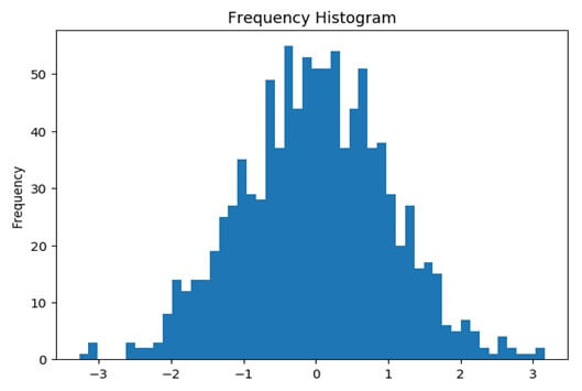
#plot Histogram on x
x=np.random.normal(size=1000)
plt.hist(x,bins=50)
plt.gca ().set (title=’frequency histogram’,ylabel=’frequency’)
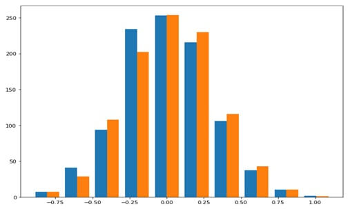
Plotting two histograms together :-
Example:-
plt.figure(figsize=[10,8])
x=0.3*np.random.randn(1000)
x=0.3*np.random.randn(1000)
n,bins,pat.hist([x,y])
Create histogram in python with bar filled:-
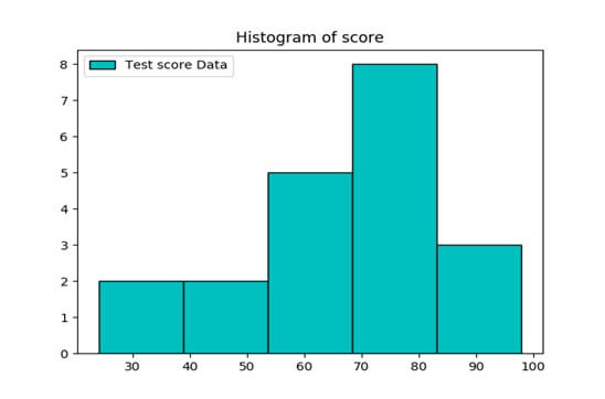
Example:-Import matplotlib.pyplot as plt
Values=[82,76,24,40,67,75,78,71,32,98,89,78,67,72,82,87,66,56,52]
Plt.hist(values,5,histtype=’bar’,
align=’mid’, color=’c’, label=’test score data’, edgecolor=’black’)
plt.legend()
plt.title(‘histogram of score’)
plt.show()
In the hist () function first arg will accept values to be plotted and second arg is number of bins.
Histype=’bar ‘will plot histogram in bar filled format, aligned to mid.edgecolor=’black ‘will indicate black border for histogram.
Output:-
Create multiple charts on one image:-
The figure function will represent the figure in python. Figure is numbered and starting from 1 to normal python staring from 0.It is the MATLAB style in which the fig size depicts the size of figure.
There are more than one chart on one page in n*m array of charts using subplot ().
The function will accept three arguments that will represent number of column and last argument will represent number of cells.
Keeping in mind that cell number is determined by the row basis.
The subplot (2, 3, 1) will represent that there are 2 rows and 3 columns.
The figure has 6 cells (2*3).
The last argument will show that chart will be displayed in first cell.
Now consider figure of 4 rows and 2 columns to draw 8 charts in single image.
The subplot function will be (4, 2, x) and the x will denote cell number.
The subplot (4, 2, 3) represent the third cell which will be first column of the second row.
Then the subplot (4, 2, 6) represent sixth cell of figure having 4 rows and 2 columns and the sixth cell is second column of the 3rd row.
The title () function will give chart to chart when we draw multiple images on one chart.