Seaborn scatter plot Tutorial with example
The Seaborn scatter plot is most common example of visualizing relationship between the two variables. Each point will show an observation in dataset. Plot will show joint distribution of two variables using cloud of points. Drawing scatterplot by using replot() function of seaborn library and role for visualizing the statistical relationship.
The replot will produce scatter plot.
Example:-#python program to illustrate
#plotting categorical scatter
#plot with seaborn
#impoting the required module
Import matplotlib.pyplot as plt
Import seaborn as sns
#x axis values
X=[‘sun’,’mon’,’fri’,’sat’,’tue’,’wen’,’thu’]
#y axis values
Y= [5, 6.7, 4, 6, 2, 4.9, 1.8]
#plotting strip plot with seaborn
ax=sns.stripplot(x,y);
#giving labels to x-axis and y-axis
ax.set(xlabel=’Days’, label=’Amount spend’)
#giving title to the plot
Plt.title(‘my first graph’);
#function ton show plot
Plt.show()
Output:-
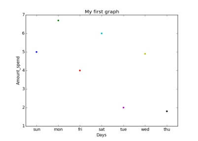
Seaborn scatter plot example Explanation:
This is scatter plot of categorical data with the help of seaborn.- The data is represented in x-axis and values correspond to them represented through y-axis.
- .striplot() function is used to define the type of the plot and to plot them on canvas using .
- .set () function is used to set labels of x-axis and y-axis.
- .title () function is used to give title to the graph.
- To view plot we use .show () function.
Parameters: |
x, y : The names of variables in data or vector data are optional and data: DataFrameTidy dataframe where each column is a variable and each row is an observation. palette : The Colors to use for the different levels of the hue variable. Should be something that can be interpreted by. hue order : The Specified order for the appearance of the hue variable levels and they are determined from the data. Not relevant when the hue variable is numeric. hue norm : Normalization in data units for color map applied to the hue variable when it is numeric. Not relevant if it is categorical. sizes : An object that determines how sizes are chosen when size is used. It can always be a list of size values or a dict mapping levels of the size variable to sizes. When size is numeric it can also be a tuple specifying the minimum and maximum size to use such that other values are normalized within this range. size order : The Specified order for appearance of the size variable levels otherwise they are determined from the data. Not relevant when the size variable is numeric. size norm : tuple or Normalize object, optional Normalization in data units for scaling plot objects when the size variable is numeric. markers : The Object determining how to draw the markers for different levels of the style variable. Setting to True will use default markers or you can pass a list of markers or a dictionary mapping levels of the style variable to markers. Setting to False will draw marker-less lines. Markers are specified as in matplotlib. style order:Specified order for appearance of the style variable levels otherwise they are determined from the data. Not relevant when the style variable is numeric. {x,y}_bins : lists or arrays or functions Currently non-functional. units : {long_form_var} Grouping variable identifying sampling units. When use a separate line will be drawn for each unit with appropriate semantics, but no legend entry will be added. Useful for showing distribution of experimental replicates when exact identities are not needed. Currently non-functional. estimator : name of pandas method or callable or None, optional Method for aggregating across multiple observations of the y variable at the same x level. If None all observations will be drawn. Currently non-functional. ci : int or “sd” or None, optional Size of the confidence interval to draw when aggregating with an estimator “sd” means to draw the standard deviation of the data. Setting to None will skip bootstrapping. Currently non-functional. n_boot : int, optional Number of bootstraps to use for computing the confidence interval. Currently non-functional. alpha: floatProportional opacity of the points. {x,y}_jitter : Booleans or floats Currently non-functional. legend : “brief”, “full”, or False, optional How to draw the legend. If “brief”, numeric hue and size variables will be represented with a sample of evenly spaced values. If “full”, every group will get an entry in the legend. If False, no legend data is added and no legend is drawn. ax : matplotlib Axes, optional Axes object to draw the plot onto, otherwise uses the current Axes. kwargs : key, value mappings Other keyword arguments are passed down to plt.scatter at draw time. |
Returns: |
ax : matplotlib Axes |
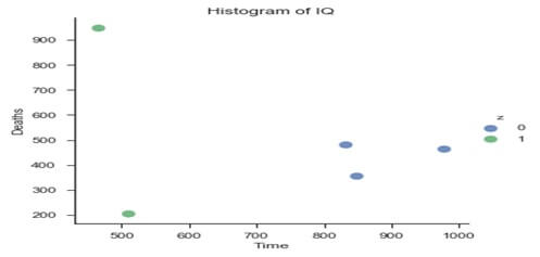
Example:-
#set syle of scatterplot
Sns.set_context(“notebook”,font_scale=1.1)
Sns.set_style(“ticks”)
#create scatterplot of dataframe
Sns.implot(‘x’,# horizontal axis ‘y’,# vertical axis data=df,#data source fit_reg=False,# Don’t fix a regression line)
Hue=”z”, # set color
Scatter_kws= {“marker”:”D”, # set marker style “s”:100}) # s marker size
# set title
Plt.title(‘Histogram of IQ’)
# set x-axis label
Plt.xlabel(‘Time’)
# set y-axis label
Plt.ylabel(‘Deaths’)
Output:-