Matplotlib scatter plot tutorial with example
Matplotlib scatter plot tutorial with example : Matplotlib scatter plot type of plot has a build in function to create the scatter plots are called as scatter (). Scatter plot is type of plot that shows data as collection of points. The position of point depends on two dimensional values in which each value is position on either vertical or horizontal dimension. The ply. Scatter () function is used to scatter plot in python programming. Like a line we define x and y axis correspondingly. Marker argument is used to set character and size can be defined using s parameter. We need scatter plot chart to compare variables.
The data is displayed as collection of points having value of one variable which determine position on the horizontal axis and value. Scatter plot is used to show relationship between two variables.
Matplotlib scatter plot example :-
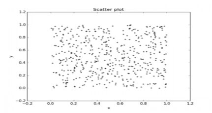
Import matplotlib.pyplot as pt#create data
N=500
x=np.random.rand (N)
y=np.random.rand (N)
colors=(0,0,0)
area=np.pi*3
#plot
Plt.scatter(x, y, s=area, c=colors, alpha=0.5)
Plt.title(‘scatter plot pythonspot.com’)
Plt.xlabel(‘x’)
Plt.ylabel(‘y’)
Plt.show()
Output:-
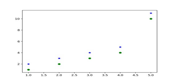
Draw two sets of scatter plot in same plot:-
We have to call plt.plot () again and add point to same picture.Example:-
#draw two set of pointsplt.plot([1,2,3,4,5][1,2,3,4,10,’go’])
#green dots plt.plot([1,2,3,4,5][1,2,3,4,5,11,’b*’])
#blue stars
plt.show ()
Output:-
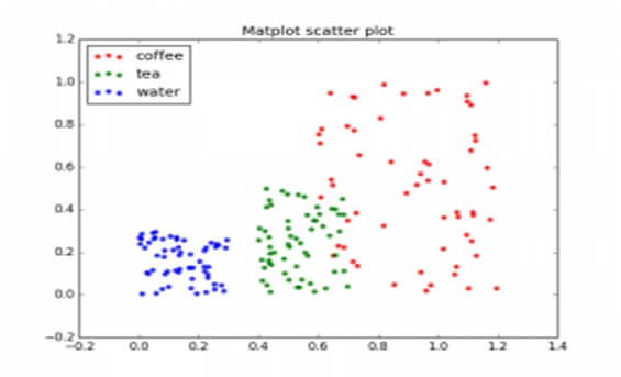
Scatter plot with groups:-
Data is classified in several groupsExample: -
import numpy as np’
import matplotlib.pyplot as plt
#create data
N=60
g1= (0.6+0.6*np.random.rand (N), np.random.rand (N))
g1= (0.4+0.3*np.random.rand (N), 0.5*np.random.rand (N))
g1= (0.3*np.random.rand (N), 0.3*np.random.rand (N))
data=(g1+g2+g3)
colours=(“red”,”green”,”blue”)
groups=(“coffee”,”tea”,”water”)
#create plot
Fig=plt.figure()
Ax=fig.add_subplot (1, 1, 1, axisbg=”1.0”)
For data, color, group in zip (data, colors, groups):
X,y=data
ax.scatter(x,y,alpha=0.8,c=color,edgecolors=’none’,s=30,label=group)
Plt.title(‘matplot scatter plot’)
Plt.legend(loc=2)
Plt.show()
Output:-+
Marker |
meaning |
. |
point |
, |
pixel |
o |
circle |
v |
triangle_down |
^ |
triangle_up |
8 |
octagon |
s |
square |
p |
pentagon |
* |
star |
h |
hexagon |
+ |
plus |
D |
diamond |