Matplotlib line chart Tutorial
Matplotlib line chart : The data frequency along with line can be represented using line plot. It is simple and commonly used plotting method. The ggplot is system for creating graphics based in it and graphics library used to provide data to ggplot. Ggplot is system that will provide data to map variables and take care of the detail. It is a plotting package that will make complexity from data in the dataframe. The function like data is in long format as column for every dimension and row for every observation. Good and well structured data will save lot of time of figure making with ggplot. In the ggplot step by step addition of new element is carried out. Adding layer will allow extensive flexibility and customization of plot. To build ggplot we use basic template used for different plots.
1) Creating a simple line chart
The data frequency along with line can be represented using line plot.
It is simple and commonly used plotting method.
Example:-
Importmatplotlib.pyplot as plt
Values=[1,5,8,9,7,11,8,12,14,9]
Plot.plot(values)
Plt.show().
Output:-
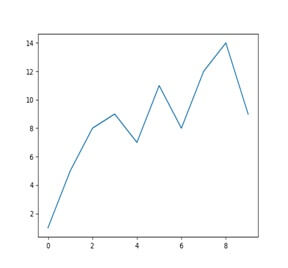
Import pyplot function of matplotlib library in name plt.
Input array to the variable named values.
Plot line chart with values and choose x axis ranging from 1 to 11.
Lastly display resultant line chart in python
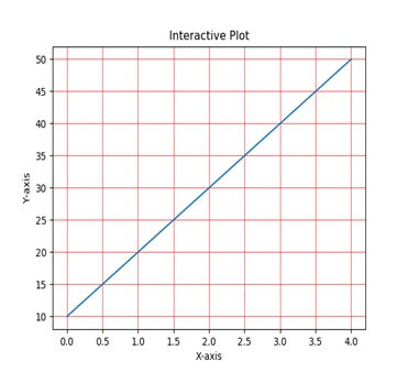
To display background grid with Python Matplotlib:-
Example:-
#import matplotlib.pyplot as plt
Plt.grid(true,linewidth=0.5,color=’#ff0000’,linestyle=’-’)
#plot a line graph
Plt.plot([10,20,30,40,50])
#Add labels and title
Plt.title(“Interactive plot”)
Plt.xlabel(“x axis”)
Plt.ylabel(“y axis”)
Plt.show()
Output:-
2) Formatting style of your plot
For x, y pair there is a third argument which is format string that will indicate color and line type of plot.
The letters and symbol of string are from mat lab and concate color string with style string.
The default string is ‘b-’ which is solid blue line.
Example:-
Plt.plot([1,2,3.4],[1,4,9,16],’ro’)
Plt.axis([0,6,0,20])
Plt.show ()
Output:-
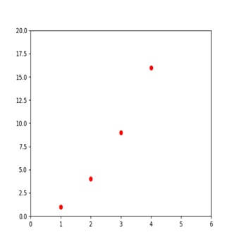
The plot () for complete list of line style and strings and axis () command takes list of [xmax, xmin, ymin, ymax].
3)Working with multiple figures and axes:-
Matlab and the pyplot have current axes and all plotting commands apply to current axes.
The gca() will return current axes and gcf() return the current figure.
You don’t need to worry about it because we take care of all behind scenes.
Example:-
def f(t):
return np.exp(-t)*np.cos(2*no.pi*t)
t1=np.arrange(0.0,5.0,0.1)
t2=np.arrange(0.0,5.0,0.02)
plt.figure()
plt.subplot(211)
plot.plot(t1.f(t1),’bo’,t2,f(t2),’k’)
plot.subplot(212)
plot.plot(t2,np.cos(2*np.pi*t2),’r--’)
plot.show()
Output:-
The figure () command is optional because it is created by default as subplot (111) and will be created by default if you don’t specify any axes.
The subplot () command will specify numrows, numcol, plot_number.
The commas in subplot () command are optional if numrows*numcols<10.