Seaborn heatmap in Python tutorial
The seaborn heatmap in python is two dimensional graphical representations of data and individual values contain in the matrix and are represented as colors. The seaborn package will allow creation of annotation heat maps which can be used in matplotlib tool as per requirement. To create a heatmap in Python, we can use the seaborn library. The seaborn library is built on top of Matplotlib and Seaborn library will provide a high-level data visualization interface where we can draw. The map is graphical representation of data where individual values are in the matrix as colors.
It is useful to display a general view of numerical data and not extract specific data point.
You will need to normalize the matrix and choose a relevant color palette.
The use of cluster analysis and permute the rows and columns of the matrix to place the values near each other according to the clustering.
It is the straight forward to make heap map as shown below:-
Seaborn heatmap Example:-
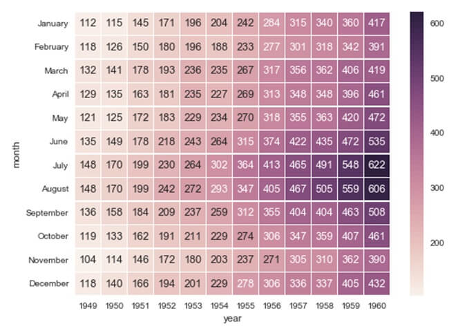
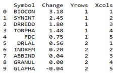
df=pd.read_csv(“c:\\users\\phara Heatmap data.csv”)print(df.head(10))
Output:-
Parameters: |
data : rectangular dataset fmt : string, optionalString formatting code to use when adding annotations.annot_kws : dict of key, value mappings, optional Keyword arguments for ax.text when annot is True. linewidths : float, optional Width of the lines that will divide each cell. linecolor : color, optional Color of the lines that will divide each cell. cbar : boolean, optional Whether to draw a colorbar. cbar_kws : dict of key, value mappings, optional Keyword arguments for fig.colorbar. cbar_ax : matplotlib Axes, optional Axes in which to draw the colorbar otherwise take space from the main Axes. square : boolean, optional If True, set the Axes aspect to “equal” so each cell will be square-shaped. xticklabels, yticklabels : “auto” bool list-like or int optional If True plot the column names of the dataframe. If False don’t plot the column names. If list-like, plot these alternate labels as the xticklabels. If an integer, use the column names but plot only every n label. If “auto”, try to densely plot non-overlapping labels. mask : boolean array or DataFrame, optional If passed, data will not be shown in cells where mask is True. Cells with missing values are automatically masked. ax : matplotlib Axes, optional Axes in which to draw the plot, otherwise use the currently-active Axes. kwargs : other keyword arguments All other keyword arguments are passed to ax.pcolormesh. |
Returns: |
ax : matplotlib Axes |
Example:-
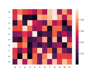
Plot a heatmap for numpy array,Import numpy as np;np,random.seed(0)
Import seaborn as sns; sns.set ()
Uniform_data=np.random.rand (10,12)
Ax=sns.heamap (uniform data)