pandas scatter plot | scatter plot python pandas tutorial
The coordinates of each point are defined by the two dimensional column and filled circles used to represent each point. The plot is useful to see complex correlations between two variables. Points would be for instance natural 2d coordinates like longitude and latitude in the map, any plot can be plotted against each other. Scatter plot will display value of two sets of data on two dimensions. In this each dot will represent the observation. The x (horizontal) and y is vertical axis represents 2 value. It is very useful to study relationship between both the variables. It will provide even more information using the colors ‘shapes. It is possible to map variable size of each dot and make the bubble plot.
Scatter plot python pandas Example :-
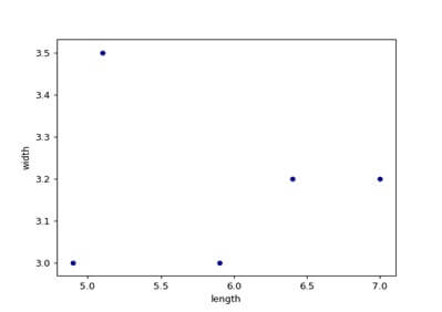
df=pd.dataframe([5.1,3.5,0][4.9,3.0,0],[7.0,3.2,1],[6.4,3.2,1],[5.9,3.0,2],columns=[‘length’,’width’,’species’])
ax1=df.plot.scatter(x=’length’,y=’width’,c=’darkblue’)
And now with the color determined by a column as well.
ax2=df.plot.scatter (x=’length’,y=’width’,c=’species’,colormap=’varidis’)
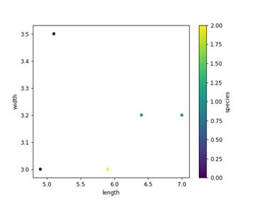
Figure Aesthetics:-
- Plotting with multiple axis
- Making your charts look less scientific
We don’t know that you could plot dataframe using pandas.
I will show how to plot scatter, line and bar and pie charts using pandas.
The bar plot will show comparison among categories.
The axis of plot show specific categories being compared and other axis represent measured value