Pandas bar plot | pandas dataframe bar plot tutorial
The bar plot will represent data with the rectangular bars with the lengths is proportional to value that represent. Bar plot shows the comparisons among discrete categories. One axis of the plot shows specific categories being compared and other axis represent measured value. Pandas are one of the packages and make importing and analyzing data much easier. Pandas dataframe.plotbar () will plot f\graph vertically as rectangular bars.
Pandas dataframe.plot.bar () will plot the graph vertically in the rectangular bars.
Pandas bar plot Syntax :-
. DataFrame.plot.bar(x=none, y=none, **kwds)Parameters:-
x :-(label or position, optional) Allows plotting of one column versus another. If not specified, the index of the DataFrame is used.
y :- (label or position, optional) Allows plotting of one column versus another. If not specified, all numerical columns are used.
**kwds: - Additional keyword arguments
Returns: - matplotlib.axes.Axes or np.ndarray of them
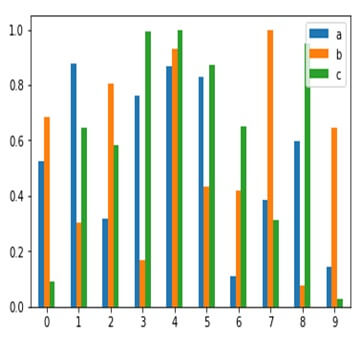
Pandas bar plot Example :
Using DataFrame.plot.bar() to plot the graph vertically in form of rectangular bars#import matplotlib
import matplotlib.pyplot
#importing pandas as pd
import pandas as pd
#importing numpy as np
import numpy as np
#creating a dataframe
df=pd.Dataframe(np.random.ran(10,3),coloumn=[‘x’,’y’,’z’])
print(df)
Output:-
Example:-
df=pd.DataFrame({‘lab’:[‘A’,’B’,’C’],’val’:[10,30,20]})
ax=df.plot.bar(x=’lab’,y=’val’,rot=0)
Output:-