Matplotlib pie chart Tutorial
Matplotlib pie chart Tutorial : The pie chart can be drawn using pie () function in pyplot module.
The pie chart matplotlib called as circular statically diagram and the area of whole chart will represent 100% or whole of the data. The pie function will arrange the piece in a pie chart of counter clock wise direction.
The area of pie present in pie chart will represent percentage of part of data.
These parts of pie are called as wedges and length of arc of wedges determine the area of wedges in pie chart.
The area of wedges will determine relative quantum of percentage with respect to whole.
Pie charts are used in the business for presentation purpose as they give quick summary of business activities like sales, etc.
They are used in survey new articles and diagrams like disk and memory.
They are like stack plots and are for certain point of time.
The important thing is use plt.pie () method to plot pie graph.
We define labels using list called activities.
Portion of the each label is defined using list called as colors. Color for each label is defined using list called as colors. The shadow is true and show shadow beneath each label is in pie chart. Strangle will rotate start of pie chart by counterclockwise from x axis.The explode is used to set the fraction of radius with which offset each wedge.
The autopct is used to format value of each label.
Pie chart is used to show parts and % share as matplotlib will handle size of slices and everything.
Pie chart is used to show parts to whole and % share.
Matlplotlib handle sis probably one of most common chart and is divided into slices.
The pie chart is easy to convey information developed in history of data visualization.
In pie chart each portion is called as slice and is proportional to different values in data.
Basic matplotlib pie chart :-
The program below shows basic pie plot chart with the pie () function.
The autopct is where we widgets are labeled with the string commands.
Example:-
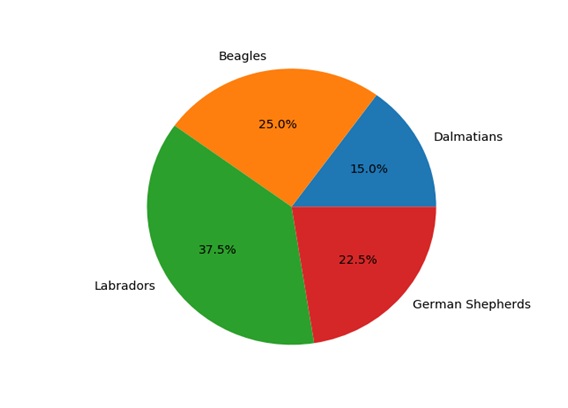
Import matplotlib, pyplot as plt
labels=’dalmatians’,’beagles’,’labradors’,’german shepherds’
Sizes= [6, 10, 15, 9]
fig,ax=plt.subplots()
ax.pie (sizes, labels=labels, autopct=’%.1f %%’)
plt.show ()
Output:-
Equal Axes:-
For fixing the shape we need to keep figure and axes aspect equal. The set_aspect method will set desired aspect.
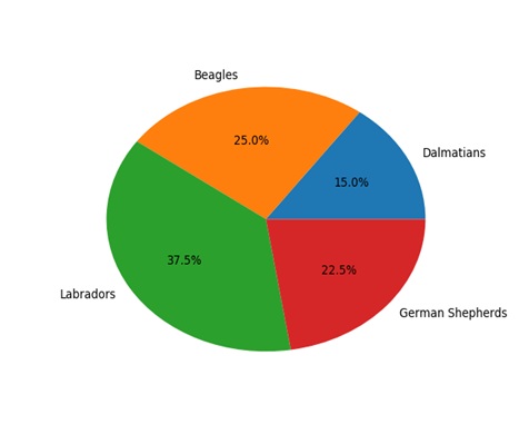
Example:-
import matplotlib.plot as plt
labels=’dalmatians’,’begles’,’labradors’,’german shepherds’
Sizes= [6, 10, 15, 9]
fig,ax=plt.subplots()
ax.pie (sizes,labels=lables,autopct=’%.1f%%’)
ax.set_aspect (‘equal’)
plt.show ()