Matplotlib python 3 tutorial | matplotlib in python
Matplotlib Python 3 tutorial : In this tutorial, we will understand the matplotlib in detail with the installation and the plotting in detail. The visualization of data is an important factor which is done by the matplotlib. It is a powerful plotting library used for working with numpy and python. The matplotlib is used as pyplot which is used to provide the interface like MATLAB and uses python because it is open source. It is powerful plotting library used in the python programming language. By using the matplotlib we can create the plots and get solutions on complex work. The matplotlib library is used for the plotting and enables us to visualize the data in graphical representation. Also plots the 2d graph and these graphs are drawn through the python script also called as the pyplot. Using the pyplot we can create the plotting easily and control the lines and formatting processes.
The use of python language is the data analysis and done by the data scientist to visualize the data.
To start the matplotlib we have to start by downloading the matplotlib.org and get started.
The matplotlib is used for plotting the library in python and create any plot.
They will create the charts as well as the graphs.
The plotting knowledge is extracted from the MATLAB programming for purpose of the graphics.
Importing process of matplotlib Python :-
Installation is the main step in the matplotlib library and uses the anaconda for setting the python enviourement.import matplotlib
Using matplotlib.py plot:-
The pyplot library is used for plotting the 2D graphics in the python language and use the python script, shell, web application and graphical users.
There are some tools used to extend the python functionality of matplotlib.
- Cartopy:-It is used for the map plotting toolkit coastlines and political boundaries.
- Basemap:-used for map plotting with map projections and political boundaries.
- Mplot3d:-used for the 3d plot
- Excel tool:-Used for exchanging the data with Microsoft excel.
Parameters of pyplot:-
Parameters |
X: - It is the array/sequence of arrays. When we take input value it is not required of the same length.
|
Matplotlib Python architecture :-
The architecture of matplotlib will contain the three layers as,- Scripting layer
- Backend layer
- Artist layer
1. Backend layer:-
It is the layer placed at the bottom and consists of implementation of various functions that are needed for the plotting.
There are classes from the backend layer as,
- figurecanvas-it’s the surface on which figure is drawn.
- Renderer:-It is class that takes care of drawing
- Event is used to handle the mouse and keyboard.
2. Artist layer:-
It is called the second layer in architecture and responsible for plotting the functions like axis having the coordinates to use renderer on figure canvas.
3. Scripting layer:-
The layer is placed at the topmost layer on which the code is run.
The methods are automatically taken and leave the care of the current state.
Advantages of matplotlib Python to visualize the data :-
- It has the same interface to mat lab to perform the operation of 2D graphics.
- There is good control over the element which includes the size, figure and, DPI.
- It has high-quality output including the SVG, PDF, PNG, etc.
- The matplotlib is used on any of the operating systems by the array backend.
- It has the ability to work with many operating systems and graphics backend.
- Also have high-quality graphics and plots to print and view graphs as a pie chart, scatter plot, heat map, etc.
- The jupyter notebook is used and developers have free time to spend on implementing rather than compatibility.
- Also has more community support it in open source tool.
- Have full control over the graph such as the thoughts, and access properties.
Difference between the matplotlib Python and seaborn in data science:-
The data visualization tool is important in analytics and gives the idea of complex data.
Python language is important for visualization of tools.
There are two languages used for visualization as seaborn and matplotlib.
The seaborn library is based on matplotlib.
The comparison between the two libraries is as follows:-
1 .Functionality:-
Matplotlib:-
It is deployed for basic plotting of the graph.
The visualization consists of the bars, lines, scatter plots, etc.
Seaborn:-
It will provide a variety of visualization patterns. Also use syntax and has interest in the default themes.
The visualization is used if we have to summarize data and show the distribution in data.
2. Handling multiple things:-
Matplotlib Python :-
It has multiple figures opened but closed explicitly.
The plt.close () will close the current figure and plt.close (‘all’) will close em all.
Seaborn:-
It automatically generates multiple figures and leads to OOM i.e. out of memory issues.
3 .visualization:-
Matplotlib:-
It is the graphics package for data visualization. And well integrated with pandas and numpy.
The pyplot module has MATLAB plotting and the commands closely.
The MATLAB user easily transmits plotting with the python programming.
Seaborn:-
It is integrated for working with the data frames and extends the matplotlib for creating graphics using set methods.
4. Data frame and arrays:-
Matplotlib Python :-
It works with data frames and arrays.
They have different stateful API for plotting.
The plot() calls without parameters, without having to manage the parameters.
Seaborn:-
Seaborn will work with the dataset and is more intuitive than matplotlib.
The replot () is API parameter to specify the type of plot which is line, bar, etc.
The plot () is used to pass the object.
5. Flexibility:-
Matplotlib Python :-
It is highly powerful and customizable.
Seaborn:-
It allows the boilerplate and provides the themes which are used.
6. Use case:-
matplotlib:-
The pandas use matplotlib and it is a neat wrapper around matplotlib.
seaborn:-
Seaborn uses the cases and it is matplotlib under hood.
Also called as the statistical plotting.
Which we should use:-
The seaborn and matplotlib visualization tools are used in python and have a difference in the use of scalability and other things.
The visualization tool should be selected for a particular work.
If anybody is doing statistics the seaborn is of good choice because it has a lot of things for the statistical tasks.
Some plots used in matplotlib Python plot types are as,
- Histograms-plot a histogram
- Pie –plot a pie chart
- Box plot:-make a box and whisker plot
- Error plots
- Scatter plot:-makes a scatter plot as the x vs y.
- Steam plot:-called as steam plot
- Bar plots-bar plot
- Step:-make a step plot here.
- Quiver:-make a 2D field of arrow plot.
- Barh –It is a horizontal bar plot
- Power spectra
Features of python plot are,
- Axes properties
- Font properties
- Line styles.
Tasks performed by visualization:-
- Clarification of factors.
- Understand the product and where to place.
- The identification of area and need
- Sales volume is predicted.
Five phases used to decide in visualization:-
A. Analysis:-
The data analysis id used for transforming, inspecting and modeling the data to derive information.
Taking decisions means analyzing the past.
The analysis is used for better decision of the organization.
B.Visualize:-
First, analyze the data and make it complex and usable.
The data is represented in the tabular form and used where the user look with specific measurement.
C.Transform data set:-
The standard of the data used to decide for effectively.
D.Document insight:-
It is the process useful for the data which is organized in document format.
E.Python Matplotlib Terminology:-
The python programming has the terminologies as the,
- Axes:-it is an area on which the data is plotted as x axis or y axis.
- Figures:-It is a complete window/page of the graph.
- Spines:-They are lines used to connect the plot.
Matplotlib Python can be used to draw different types of plots,
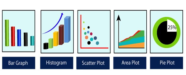
- Scatter Plot
- Line plot
- Bar Graph
- Histogram
- Pie Plot
- Area Plot
- Hexagonal Bin Plot
Need of data visualization:-
It will perform the task as follows,- Help to understand which product to place
- Easy way to initialize and absorb the data.
- Called as precursor to make the high-level data analysis and ML.
- Identifies the areas needed to improve and the attention.
- The sales volume is predicted
Advantages of matplotlib Python :-
- It helps to analyze and explore big data easily.
- It will simplify the complex quantitative information.
- Also identifies the relationship between variables and data points.
- It will explore the new patterns and hidden patterns in data.
The data visualization has considerations as:-
- Visual effect
- It has accuracy
- Efficient
- Data type and scale
- Coordinate system
There are also image functions in the matplotlib Python as follows,
Sr.no |
Function and Description |
1 |
Imread:-Reading the image from the file in array. |
2 |
Imsave:-Save the array in image file. |
3 |
Imshow:-Display an image on the given axis |
Sr.no |
Function and Description |
1 |
‘-’ it is the solid line style |
2 |
‘-.’Dash dot line style |
3 |
‘--’ Dashed line style |
4 |
‘:’ It is the dotted style |
5 |
‘,’ pixel marker |
6 |
‘.’point marker |
7 |
‘o’ circle marks |
8 |
‘<’ triangle left |
9 |
‘>’triangle right |
10 |
‘1’tri down marking |
11 |
‘2’tri up |
12 |
‘+’used as the plus marker |
The color abbreviation is as:-
character |
color |
g |
green |
b |
blue |
c |
cyan |
r |
red |
y |
yellow |
m |
magenta |
w |
white |
k |
black |
Steps for Simple Matplotlib Python plots:-
- Import the required libraries:-It is the first step in the plotting. We have imported numpy which is used to generate the random numbers; also pypot is used to plot the numbers. The matplotlib inline is used to display plot in the jupyter notebook.
- Defining or importing the data set:- Here we define the dataset of random numbers using random method. We use the print method to create random numbers.
- Set the plant parameters :- We set the styles of plot coordinates, titles of plot and the line width.
- Display the created plant :- It is used to display the created plan.
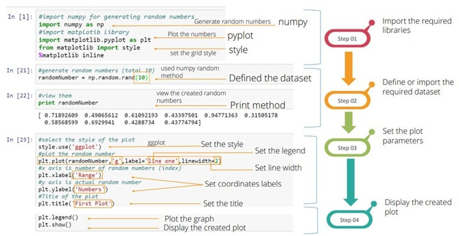
It will come with plot that will help to understand the pattern and make correlations.
Basic code is given as follows:-
Example:-
import matplotlib.pyplot as plt
import numpy as np
data=np.arrange (100,201)
plt.plot (data)
plt.show ()
Output:-
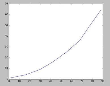
1. Line plot :-
There are list of the information’s about the sales and advertisement and use the list for making line plot in python language.
First step is the importing of matplotlib,
Example:-
import matplotlib.pyplot as plt
y= [1, 4, 9, 16, 25, 36, 49, 64]
x1= [1, 16.30, 42, 55, 68, 77, 88]
x2= [1, 6.12, 18, 28, 40, 52, 65]
After loading the matplotlib some data is used for making the line plot by using simple code,
plt.plot (tv.sales)
plt.show ()
Output:-
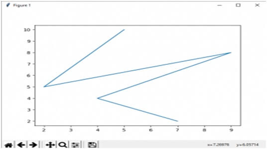
Example:-
from matplotlib import pyplot as plt
x= [5, 2, 9, 4, 7]
y= [10, 5, 8, 4, 2]
plt.plot(x, y)
plt.show ()
Output:-
2. Bar plot : -
These bars are plotted horizontally or vertically.
It wills show the comparison among discrete categories as one axis shows the specific category and the other axis will represent the measured value.
Matplotlib will provide API function to be used in the MATLAB style and the signature is used with axes of the objects as,
Ax.bar(x, height, width, bottom, align)
Parameters:- |
X:-sequence of the scalars |
return |
Container: |
Other parameters |
Color:- |
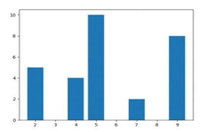
Example:-
from matplotlib Python import pyplot as plt
x= [5, 2, 9, 4, 7]
y= [10, 5, 8, 4, 2]
plt.bar(x, y)
plt.show ()
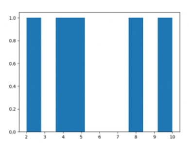
3. Histogram:-
It is used for the graphical representation of probability distribution.
Also called the bar chart so by using the bar chart and matplotlib we can easily create the histogram chart.
Advantages:-
- It displays the number of values with the specified interval.
- Also suitable for large data set as generated.
Example:-
from matplotlib import pyplot as plt y= [10.5, 8, 4, 2]
plt.hist(y)
plt.show ()
Output:-
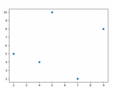
4. Scatter Plot:-
The scatter plot is used to plot the data points on the vertical and horizontal axis.It is used to plot the graph and use the data as a collection of points.The data table is represented by x and y axis. It will depend on the two-dimensional values used in the matplotlib.
Parameters:-
Parameters:- |
x, y: - is the scalar and has data positions.
|
Advantages:-
- They will show a correlation between variables
- Also easy to find clusters
- Suitable for the datasets.
- Possible to represent each piece of data as a point on the plot.
Example:-
frommatplotlib import pyplot as plt
x= [5, 2, 9, 4, 7]
y= [10, 5, 8, 4, 2]
plt.scatter(x,y)
plt.show()
Output:-
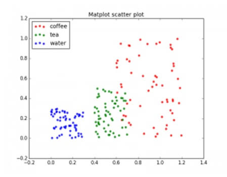
Example:-
import numpy as np
import matplotlib.pyplot as plt
n=60
g1= (0.6+0.6*np.random.rand (N), np.random.rand (N))
g1= (0.4+0.3*np.random.rand (N), 0.5*np.random.rand (N))
g1= (0.3*np.random.rand (N), 0.3*np.random.rand (N))
data= (g1, g2, g3)
Colours= (“red”,”green”,”blue”)
groups= (“coffee”,”tea”,”water”)
fig=plt.figure ()
ax=fig.add_subplot (1, 1, 1, axisbg=”1.0”)
for data, color, group in zip (data, colors, groups):
ax.scatter (x, y, alpha=0.8, color, edgecolors=’none’,s=30,label=group)
plt.title (‘matplot scatter plot’)
plt.legend (loc=2)
plt.show ()
Output:-
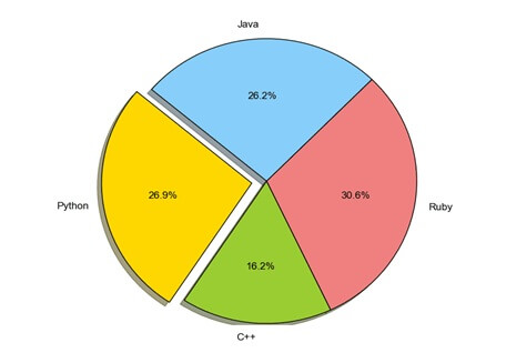
5. Pie Plot:-
The pie chart will display the series of data and show the size of items in a series.
API of pie () will generate the pie diagram for the representation of the data.
The area of each wages is given by x/sum(x).
If the condition as, sum(x) <1 the value of x will give the fractional area and array will not normalized.
Parameters:- |
X:-it is like array wedge sizes. |
Advantages:-
- They will summarize large data set in visual form
- Also, display the proportions of multiple classes of data.
- The circle size is made proportional to the total quality.
Pie Plot Example :-
import matplotlib.pyplot as pltlabels=’python’,’c++’,’Ruby’,’java’
sizes= [215,130,245,210]
Colours= [‘gold’,’yellowgreen’,’lightcoral’,’lightskyblue’]
plt.pie (sizes, explode=explode, labels=labels, colors, autopct=’%1.1f%%’, shadow=true, startangle=140)
plt.axis (‘equal’)
plt.show ()
Output:-
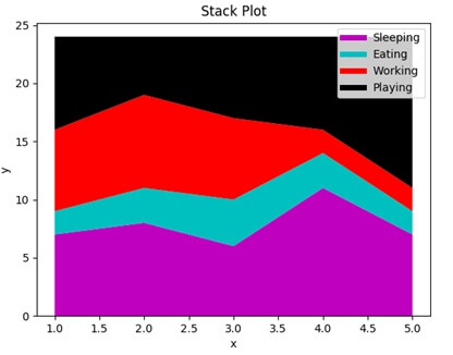
6. Area Plot:-
The area plot is the same as the line plot also known as stack plots.
It represents the numerical variable and follows another variable.
The stack plots are working on the stacked areas.
The plots are used to track the changes for two or more groups.
Example:-
import matplotlib.pyplot as plt
days= [1, 2, 3, 4, 5]
sleeping= [7, 8, 6, 11, 7]
eating= [2, 3, 4, 3, 2]
working= [7, 8, 7, 2, 2]
playing= [8, 5, 7, 8, 13]
plt.plot ([], [], color=’m’, label=’sleeping’, linewidth=5)
plt.plot ([], [], color=’c’, label=’eating’, linewidth=5)
plt.plot ([], [], color=’r’, label=’working’, linewidth=5)
plt.plot ([], [], color=’k’, label=’playing’, linewidth=5)
plt.stackplot (days, sleeping, eating, working, playing, colors= [‘m’,’c’,’r’,’k’])
plt.xlabel (‘x’)
plt.xlabel (‘y’)
plt.title (‘stack plot’)
plt.legand ()
plt.show ()
Output:-
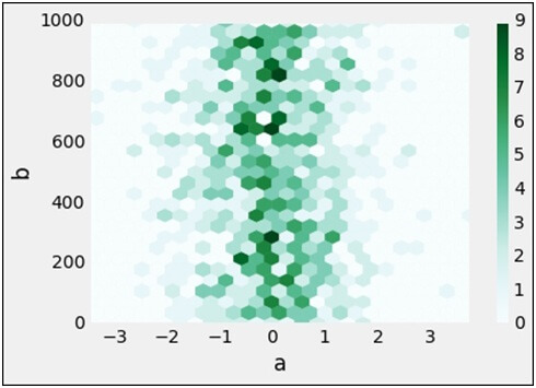
7. Hexagonal Bin Plot:-
The bin plot is created using the dataframe plot function and useful if the scatter plot is small.
It will help to bin spatial area of the chart and the color that hexagon can interpret.
Also called lattice and divided into number of the grids.
They are based on the data points of distributions of the variables.
They are used when the number of points in the distribution is large.
Example:-
df=pd.Dataframe (np.random.random (1000, 2), columns= [‘a’,’b’])
df[‘b’] =df [b‘] +np.arange (1000)
df.plot (kind=’hexbin’, x=’a’, y=’b’, gridsize=25)
Output:-
The matplotlib is used in various enviourement as follows,
- The jupyter notebook
- Also the python script
- Ipython shell
- Web application